In mid 2015 my life was coming down off the worst rollercoaster ride I'd been on. My wife and I traveled to Europe to shake off the proverbial hangover and I spent the entire trip reading 40K books and listening to podcasts after more than a decade away from the hobby. Over the following months I dug out what I'd brought along - lots of unassembled and unpainted models, and very dry paint. Though I had a few productive Saturdays for the most part I didn't make any hobby progress, but as the months have gone on I've re-acclimated myself just in time for the unveiling of 8th edition. This blog is intended mostly to be a record of my hobby progress for myself, since I can't remember a h*ckin thing if it isn't written down these days.
The main problem I've been struggling with is trying to fix my paint scheme. After my initial disastrous Blood Angels army (let's talk about paints in the winter in South Dakota) I'd done about 2000 points of a DIY Space Marines chapter in the late 90s with Games Workshop paints, and they've turned over pigments twice since then. I was never particularly happy with the original grey color ever since someone said "Hey, nice Space Wolves" so I took this as an opportunity to start a little more fresh.
 |
| It's toaster quality because that's as good as digital cameras were in like, 2002. |
Behold: the Granite Fists. Check out those sweet second edition Rhinos, kids. These were never the best quality of paint jobs, but there are a lot of hours of love in that picture. It was an army I was very proud of at the time, and though I only got a handful of games in this was one of the few genuinely creative outlets I had at the time. I think this was the only time the army was ever fielded in fully painted format - maybe one other convention.
This image is a decent encapsulation of the intended paint scheme. Codex Grey over a black undercoat with uh.. Regal Blue? as the primary contrast color, lots of Boltgun Metal, Bad Moon Yellow on the chest emblem, with Blood Red, Chaos Black, and Bleached Bone as accent colors and some deep brown as a base. At least it wasn't goblin green.
Not a one of those colors exists in the modern Games Workshop line. The first stop was Vallejo paints, as they have close analogs to all the original colors. A few models of shaking off the rust yielded some decent results that weren't far off from what I'd originally had. I went several months with no notable progress (and no photos), which I blame on my infant son and my wife's work being a madhouse. Early 2017 was rough on personal time.
During the many months between buying the paints and actually getting something painted, I discovered the world had passed my shitty painting strategy by. Games Workshop had reinvented its paint line in an amazing way with all the new types of paints that obviated the need for mixing, and especially the glosses. I'm not a skilled enough painter to reliably reproduce a mix so I never properly highlighted my original miniatures, and got good enough at drybrushing to leave dark recesses. Turns out, I didn't have to do any of that nonsense and could just turn to Agrax Earthshade. Sweet, sweet Agrax Earthshade.
 |
| Agrax: neat-ish, messy, none |
This shows the same basecoat of grey with 3 variations: a neat Agrax shade, a messy Agrax shade (the first attempt I made), and no shade at all. The difference is phenomenal. I'd spent so many hours trying to avoid any paint going in the recesses of my models, and this stuff made it so I could just slap on thin coats and never worry about it. There's no question that the tedium of painting the models so carefully was a big part of what I never enjoyed about that phase, and this new tech in my arsenal made completing a large army actually feasible in my mind. Some amount of iteration later, and we've got a good test model.
 |
| Those recesses tho |
To me this felt like a faithful adaptation of the original Granite Fists scheme, and I was pretty happy. Right up until I found an old Techmarine I had painted in the original set.
 |
| Definitely not the same grey. |
Butts. So much for color match.
It was at this point that I said hell with it. I'd found a store nearby that actually has people who play Warhammer, and they carried GW paints. It was time to go back to square one. I mentally resigned myself to being okay with repainting my entire army -- if this wasn't a color match, nothing would be. On top of that since I'd never highlighted or washed my original army, odds were good that I would've had to go back over every single model and, optimistically, do just those two things. And also re-base them. In reality even the best models I'd painted then are likely to look like poo compared to what I'd be able to do now with the improved GW paints and a lot more patience.
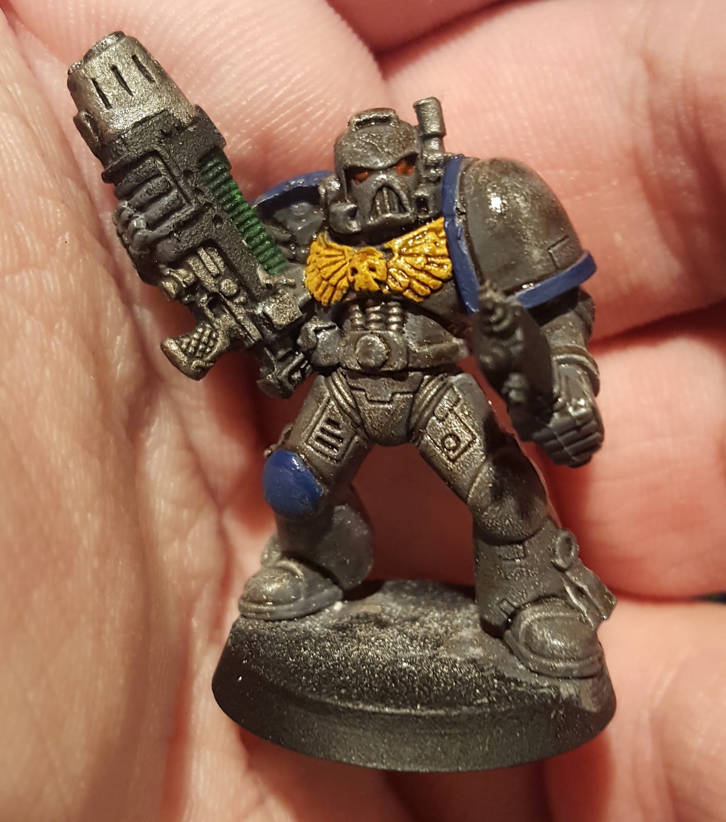
So, as they say, in to the breach. I picked up some more GW paints to try to capture what I'd always had in my head as the Granite Fists colors, and started with the darkest grey: Mechanicus Standard. I also picked up Averland Sunset because I was unable to use the Vallejo colors to achieve a good yellow on the chest emblem without like ten coats.
 |
| OG 90s, Vallejo, and GW 2017 Base colors |
The model on the right is the dead simple foundation that goes all in on the GW colors. Mechanicus Standard Grey base, Leadblecher with some Nuln Oil in the creases, a single coat of Averland Sunset on the chest emblem, and Kantor Blue on the pauldrons. Any non-Nuln areas were washed with Agrax Earthshade. While I'm not a fan of Kantor Blue on its own, there's a lot of possiblity to improve that with a layer and/or wash.
Sidebar, I have to shout this out before moving on: holy smokes is Averland Sunset a great color. This was one of the worst parts of the original model since building up yellow layers is traditionally miserable, and it looks amazing with nothing more than one coat and an Agrax gloss.
The next step was to try some highlights. As you might have noticed, I didn't highlight before using Agrax which is a mistake. I went to another model and did Mechanicus Standard again, but this time I used a liberal drybrushing of Stormfang to attempt to give the model more texture. You can see my bad attempt at a post-wash highlight against a highlight before wash, and the difference is stark.
I was optimistic at this point that a heavy Agrax wash would be all I would need for the model to come out well. I'm not 100% sure that the results are what I want.
While there's no question the overall effect is striking, it's so drab that the miniature looks like it had been an older metal once been painted then stripped. What's under the shade is so dark that the shade's color ends up being very strong to the point where it appears to be more brown than black. At the advice of a coworker, I'm going to finish out more of the detail and see how it looks, but I strongly suspect I'll need an interstitial layer of grey between MSG to lighten the model up before Agraxing the crap out of it.
Alternatively, full Agrax shade may just be the wrong approach and I need to do a better job of layering and edge highlighting.
I'll say this: nobody is going to mistake a model of this gradient for a Space Wolf. More experimentation lies ahead.