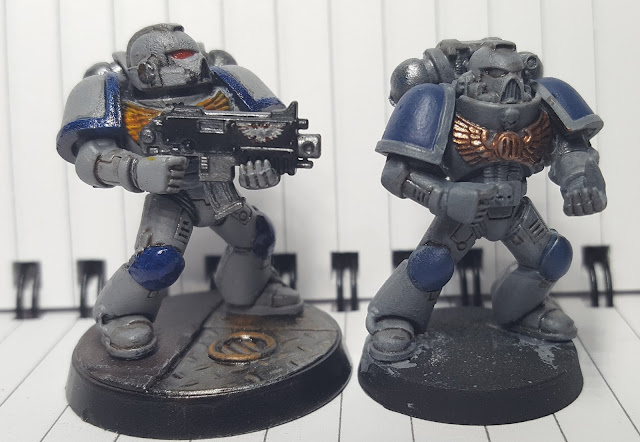
Earlier in the week I did a second model with a deep-but-not-as-deep-as-before Agrax wash over Mechanicum Standard Grey, but inverted the color on the shoulder pads. You can see there's a good improvement in top-down readability by bringing out a block of blue, but the overall model is just really dark. Even with a highlight layer of a softer blue tone, I don't think this is going to look good on a tabletop. As much as I like the gritty feel of the full Agrax wash, I think it needs to be over a lighter color if I'm going to go that route.
The reality of my situation as a dad who doesn't get a lot of time to paint and who actually wants to play the game sometime soon means that I can't realistically edge highlight the entire army. At the same time I don't really like the heavy-drybrush look on Marines. What's a gamer to do?
I spent a day or two wondering what the next step should be when Duncan himself came to the rescue with a painting plan I could get behind.
Away we go! Another test model, this time with some Balthasar Gold on the chest emblem, which I've been thinking about using as a way to designate higher-ranking Marines. This 1.5 "wetbrush" layers of Dawnstone (layer version) not particularly carefully applied over MSG, with a careful Agrax wash in the appropriate recessed areas.
This is ... good. The grey isn't so overwhelmingly drab, and the gold definitely goes bronze with a layer of Agrax. I'm not sure that it's a good replacement for the yellow on the chest emblem, but it'd be great to add more color to character models.
Here it is up against the other two recent test models I've done. While the other models look a little sharper on the contrast, I haven't done a drybrush layer and none of the gunmetal colors are inked. I think that the gloss layer also helps the photography a lot and getting a transparent layer over the whole model will work wonders.
A better comparison of why the heavy Agrax wash doesn't work very well is more plainly visible when photographed against a darker (albeit reflective) surface. The detail isn't visible - it's just a bunch of dark ink over dark armor.
Optimism returns! Let's finish this model out next week and see what it looks like.


No comments:
Post a Comment