We last left off with a freshly Agrax-washed test model. The grey is substantial, but very dark. This looks more like a metal model that has been primed then paint-stripped.

The goal today (last Wednesday actually) is to see what this looks like after the rest of the details have been painted in. I used Kantor Blue on the pauldron trim and one kneepad, Leadbelcher and Nuln Oil on the joints, cabling, and plasma rifle, as well as some green on the plasma rifle and red on the eyes. I went with the "just do a line on the center of the eyes" tactic and this is the first one that's come out in a way I like in a very long time. There's no additional highlighting here, so the pauldrons have a little more room to further pop.
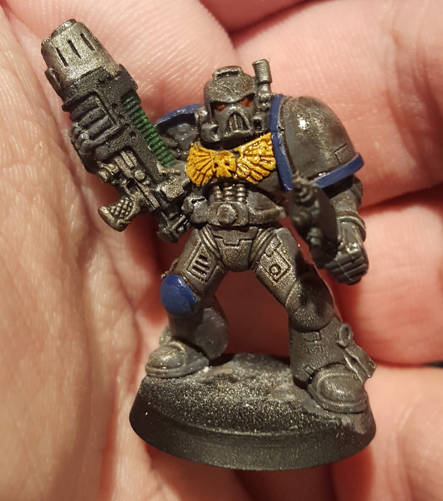
From the front, this is satisfactory. Doing the kneepad is enough color to make the model look painted, and if I'd finished the purity seal and put a brighter green on the plasma rifle it'd be decent. It's possible I could do the belt in blue, but most models are going to have that covered by a bolter so it's not relevant. Additionally not every marine has the kneecaps to paint, so most models will end up with less color than this.
The biggest problem is that from the top, it's the same problem. This isn't a great shot, but it gives you an idea of how much color is lost just from top-down lighting instead of head-on lighting. The chest pauldron is really the only visible color on the model, and that's covered by the bolter in many cases. The shot on the left is with an unfinished backpack is incomplete, but as I was fiddling in my bitz box to figure out which one fell off, and apparently Past Me did something smart and tried a variant color. If the center of the backpack is blue as it is on the model on the right, the color improves considerably from a top-down perspective.


Needs the metallic color on the sides, so let's plug that in real quick and take a look from the top.

I'm liking this a lot for Tactical marines, but I think there are other models where this breaks down. Terminators in particular don't have a great place to put this kind of accent color, and neither do most vehicles.
I think both problems may be solved by inverting the pauldron colors. I'm going to try Kantor Blue on the surface of the pauldron rather than the trim, and possibly using a bronze or copper color on the pauldron trim instead of grey. Having a larger block of the model be blue gives me more options when it comes to larger models to have a handful of large accent blocks instead of trying to restrict it to trim only. More test models this weekend!
No comments:
Post a Comment